Welcome to the brand new and MUCH improved unOriginalMom.com! Yipeeeeee!
This has been a LONG time coming. I have been on the same free theme with (ironically) original designs by yours truly since I started this blog way back in January of 2013…and a redesign has been on my mind for a good 12-18 months now. Confession: I may have a bit of a procrastination problem.
Want to take a walk down memory lane with me? Let’s take a peek at the ORIGINAL unOriginal Mom header-
Yikes. I’m not sure why I ever thought that looked good. It’s straight out of the year 2003.
Thankfully, I quickly replaced it with this header. Still not great, but at least an improvement.
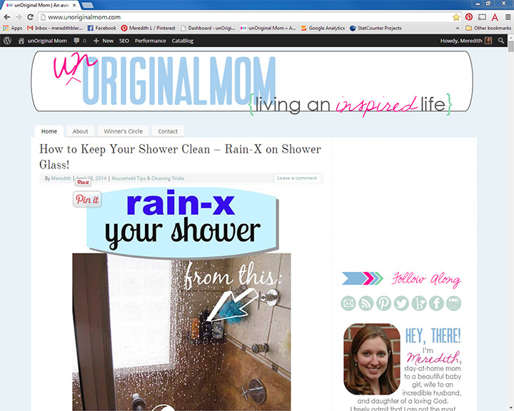
Then came a slightly tweaked version with a brighter color pallet and a new tag line, as the purpose of the blog quickly evolved from a “Pinterest review” type blog to a more generally creative “mom blog.” This one was around for quite a while.
Then, for the most recent version, I did a new header and lost the blue background. This version was around for about 6 months, I think.
And finally, the AMAZING Tori Grant created not only a terrific blog layout, but a beautiful set of graphics that captured exactly what I was looking for but couldn’t quite put into words.
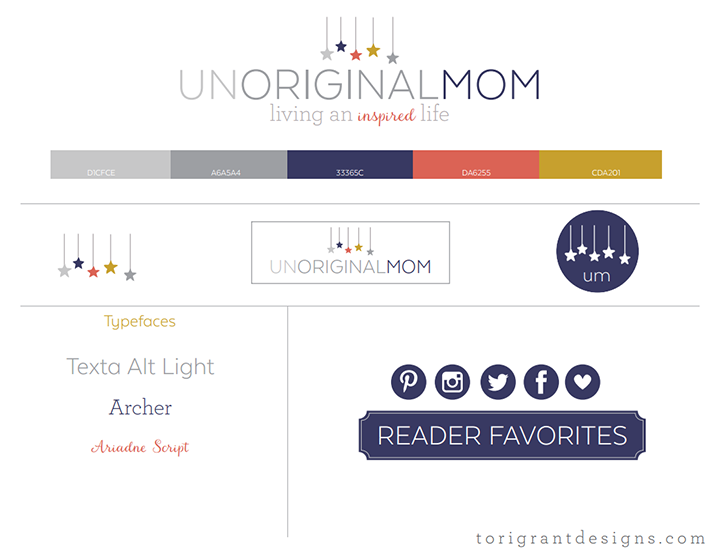
The new layout is so clean and professional – and I love that there are now post excerpts on my home page so recent posts don’t get buried as soon as a new one is posted.
I’ve always been proud of my content, but a little embarrassed by the look of my blog. No more! I am ecstatic to call this little piece of the internet “mine.”
And, along with the roll out of my new design, I’m also (FINALLY) rolling out an email newsletter, which has been a major blogging goal of mine for quite a while – hooray! There will be more on this in the next week or so (including some awesome freebies for subscribers), but if you want to be among the FIRST-EVER email subscribers to unOriginal Mom, you can click here to sign up now!
What do you think of our new look??


Get your copy of my FREE meal planning binder!

Sign up to get a free copy of my meal planning system - an 11 page printable meal planning binder, complete with a pantry inventory, shopping list, and more to help get on top of your menu each week!








Wow! What a fun little walk down memory lane. I actually felt SUPER convicted while hearing your own story of re-design procrastination because that’s exactly where I am at with my site…. This summer, it might be time to bite the bullet and make some bold, sweeping changes. I’m just so inspired by what you and Tori have done together in this grand collaboration. The new design is so fresh, so whimsical, so YOU! Congrats! Also, I’m very excited to sign up for your newsletter. The more unOriginal Mom news in my life, the betta’!
Aw, thanks friend! Your layout was actually an inspiration to me, I’ve always loved it and excited to finally have something similar :-) Tori did an AMAZING job, didn’t she? And thanks for being one of the first subscribers!! I’m excited to get that up and running, too!
This looks fabulous! I love how crisp and clean all the elements are. I’m currently trying a redo on my blog as well….but I just can’t find the time! I barely have enough time to come up with posts! I’m such a slacker blogger and can’t ever get ahead. :) This has given me a little motivation to finally *make* the time for whipping my blog into shape, so thanks!
Thanks Christine!! I am loving it too :-) It was so hard for me to prioritize getting this done…I hear you on that! There just aren’t enough hours in the day!
I’m loving the new look. I just changed my blog design after spending the past year trying to make a decision. Had to hire someone because I can’t make decisions nor can I work the web at all. Love what you’ve done, the colors are so pretty!
Thanks so much, Jenna! I was in the same boat as you…kept dragging my feet on doing it myself, and I’m SO glad I ended up hiring someone to do this – she did an incredible job, and so much faster than I could have done it, too.
I love the stars element and the colour scheme. Tori did a great job!
Your new look is fab – very modern and classy, but fun too.
To be fair though I don’t think your previous versions are as bad as you are thinking they were – I do like the way you changed your tag line as your blog developed.
I love the new look (although I didn’t think your past ones were bad either)! We just did a blog makeover, too, though we’ve only been doing this for 7 months now. Congrats!!
Thanks so much! It’s SO fun to get a blog makeover, isn’t it? “Real life” people just don’t get it, haha, so I’m glad to have other bloggers like you that totally do :-)
The new palette and logo are beautiful!
Thanks so much, Jenny! I’m a month in, now, and still loving it :-)
Wow, what an exciting journey of evolution for unOriginalMom.com! It’s amazing to see the progression of your blog design over the years. The new layout looks fantastic, and it’s great to hear that you’re proud to call it your own. Congratulations on the redesign and the upcoming email newsletter launch – looking forward to being part of your subscriber community!